Friday, July 25, 2014

Top 7 Digital Design Tips


In a business, marketing is absolutely needed. In the fact, income is coming from here. Marketing starts from the advertisement. From the advertisement, people will recognize the product or the service. When people know the product, the chance to get the customer will be bigger too. To introduce the product or the service effectively, there are two things to note. Attract with visual appearance and make them remember by showing the advertisement over and over. But the good digital design is absolutely needed. Unfortunately, make the good design is not easy. But it can be easier. With these digital design tips, designing digital design will be more directional.

1. Define the goal and define what you want to get from the digital design. Before making a design, you need to decide it. From here, you can see what you need to do and how to make it.

2. Learn about the product and the service. Without knowing the product or the service to promote, there is no chance to deliver the right message. In here, you need to make the product or the service as attractive as possible. Focus on the pros and make it looks useful for the customers.

3. Decide the right message to deliver. Message is coming from visual appearance and words. But you need to decide what to tell first. You have to decide the message to deliver. In this tips, make sure to use the persuasive message.

4. Start from the simplest and the main things. In here, you can start the design from the background color, the graphic shapes and the product.

5. Use the right color to give the right impression. Besides giving the specific impression, color can strengthen the message too. You need to use the power of color very well. In here, make sure the color, the product and the message relate to each other.

6. Use the power of photo. Actually, it has used in many digital designs. In a promotion digital design, photo can give a focus to the digital design. Beside it, it can give the better message and the better image to the prospective customers too.

7. Make the design as simple as possible. Simple is good. It looks easy to look and eye catching too. But make sure to make it fully with persuasive message. At least, people can see the message only by a single look.

Those tips are the very basic tips, so it is easy to be applied. But there is one more thing to know. To make the good design, you need idea. You can find it anywhere. Even you can find it from the other digital design. But skill is also needed. Maybe this is the big problem, especially for the unskilled people. If you face this situation, hiring the professional designer will always be the best solution. But you also need to choose the right and the reliable designer. In searching a reliable designer, there are several things to note. At least, you need to consider the experience and the track record. But if you are looking for the better service, http://www.sribu.com/en/http://www.sribu.com/en/ must be the first site to visit.

Top 7 Creative Modern Toilet Design


Despite it being smaller in size than any other room in the house, the bathroom and toilet are some of the most important places for its household. It is a place to freshen up and most of all, maintain hygiene. The following are modern design for your toilets you can install at home.

1. Guitar toilet case
Make your toilet stand out by replicating the physical features of a guitar on your toilet top. This effectively brings the attention to the toilet and is a simple make over with very little expense to chip in.

2. Built in shelves behind toilet
Why leave the walls behind and above the toilet empty if you can use it as storage? Go over head or install one that blocks the entire space behind the toilet. This leaves extra space for room of movement and gives you more shelves to store your stocks. The case installed behind these toilets can vary in materials ranging from coated wood to match your flooring or steel to accentuate its modern look.

3. Eco-friendly Toilet and Washer

More often than not households are wasting energy and electricity on devices that can use an integrated plumbing system instead. Integrate your washer and your toilet to optimize the use of water on a daily basis. This way you save on your bills as well as the environment. The eco-friendly toilet and washer is placed one above the other to save space. Using steel mainly you are bringing home eco appliances to a whole new level.

4. Black and white
Small apartments can benefit from the tiny space designated as a bathroom. Paint the walls in black and leave the rest of the appliances white to accentuate them. A black dot on white tile flooring helps add to the sense of space and highlights its modern design. With personal collections of framed art you bring life into a small living space.

5. Composting toilet
The minute you flush a composting toilet reprocesses the waste that it collects. This is a very versatile function designed for the long ter. In comparison with toilets of today that channel them to a septic tank immediately for collective processing, these toilets re-process. Though still not popular, it has received great appreciation in large cities.

6. All in one toilet
More on saving limited bathroom space, the all in one toilet does the trick. It opens up to three layers f function: a toilet at the very bottom, above which is a sliding sink and at the peak is the foldable mirror that functions as reflection. With the most vital functions provided by one appliance you save yourself a great deal of space.

7. Open-glass shower partition
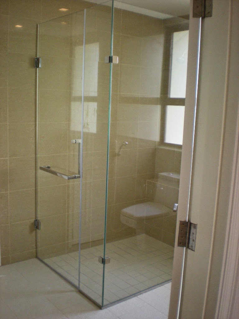
If most partitions of glass require opening and closing or locking and sliding, open partitions are far easier to deal with. They are a great way of solving the issue of space without eliminating its modernity. This is often the case of small homes or studio apartments with limited space. Creating a flowing space between the toilet and shower, open partitions is your answer to a modern design bathroom.

7 Great Web Design Inspiration


Attract people with appearance, this is the purpose of the web design. No matter how good the back end is, without the good web design, no one will visit the site. Now, there is one question about this. What makes the web design looks attractive? How to make it? Before creating a web design, web designer needs to know about what people want. They also need to know what people like for a web design. To give more reference, these are the great web design inspiration ideas.

1. Ellen DeGeneres Show web design
 This site is pretty good. It looks neat. The content is also well placed. Maybe the layout looks simple. There is just used a sidebar and a container. But the simple layout make this site easy to use and make the content easy to read.

2.  Source web design
In here, you will see the simple, minimalist and clean web design. The site dominated by the white color. The text looks contrast. It makes the content looks clear and easy to read.

3. Post Graphics web design
Actually, this is a web design for a map web app. The design looks clean with map and content oriented. With the simple design, the web looks easy to look.

4. Independent Design Studio – Manifesto Futura
The black and white web design, this is the first impression that you will get. In the simplicity and the old style web design, this web design looks perfect for a web design inspiration. The design is picture oriented. For this, the design dominated by picture in the square form.

5. Delis Archiv web design, web design for a professional website
On the look, you can see the professionalism of the web owner. The modern look was applied well. The content informed well too. With the simple design, this site looks user friendly enough.

6. Conti Bier web design
This web design looks perfect for a food or beverage site. It looks good for a bar or restaurant site too. On the design, it used many pictures. But the pictures are well placed. The color composition looks balanced. It makes the site looks attractive.

7. Marcus Castro Photography will be the best inspiration for a photography website
The web design focuses on the photo and the pictures designed on the tile style. Simple and minimalist, this style make this site looks easy to look.

The web designs are not just attractive. They also has the good look and aesthetic. The most designs appear with the simple look and layout. It helps the visitors to use the site easily. But making the good web design is not easy. After watching these web designs, course you get the idea now. But you need more than it. Skill is also needed. With the skill, you can realize the web design inspiration. This is the problem. The good skill is only owned by the professional. This is why asking the professional will always be the good solution. The next question is how to find the reliable web designer? If you wonder about it, http://www.sribu.com/en/simple-web-design will answer your concern.

7 Steps to Create Amazing Poster Design


Business is one way to get the better life. With business, people can be more independent. They can control their income and working time. But business will never be success without the good product, service and marketing strategy. To get the good profit, it must be managed well. Marketing is a unique business aspect. Corporate income is so depending on it. Marketing helps businesspersons to get the good profit. Without it, there is no product is sold. In the other words, there is no profit. As one of the marketing strategies, making poster becomes one of the popular methods. But businesspersons need the attractive and persuasive poster design. To make it, there are several things to note. If you want to know it, these are the steps to make the good poster design.

1. Define the goal
The specific goal needs the specific design. In defining the goal, people also need to consider about the product and the market. Knowing the character of the target market is also necessary. From here, people can make the effective poster design.

2. Choose the right too
Actually, there are many poster design tool. Even people can make a poster from the very basic tool such as word processor. To get the better work, image editor application is more recommended.

3. Think about the message
Poster without message is useless. Whatever you make, it must have a message. The good combination between the picture and the tagline will create the good poster. The goodness is not just about the appearance, the impression and the message is also easy to catch.

http://www.sribu.com/en/categories/poster-design/contests/poster-christmas-untuk-madelineflorist-50c55e7c3c0aa17be40001b2/overview

4. Apply the right background color
Background color must have a character and support the poster design entirely. To get it, people can choose it based on the product itself. Beside it, make sure to use the power of color very well.

5. Add the product picture to the poster
This is useful to help people to understand the poster easily. With the product picture, people can see the product first.

6. Put the picture, the graphic design and the tagline on the right place
Maybe it looks simple, but it can affect to the message and the appearance of the poster design. In here, you have to be careful. At least, make sure the design looks good first.

7. Do not forget with the company name and the contact person
For an advertisement poster, these things are really important. Your product will never be known or ordered without company name and contact person. If you have the strong brand and the wide marketing partner, maybe it looks unnecessary. But if your product only sold in one store, company name, store name and the contact person are needed.

Make the good poster design is not easy. Skill and creativity are needed. Course it looks something difficult for nonprofessional. This is why the most people prefer to hire the professional designer. Unfortunately, find the reliable designer can be another problem. Look to the portfolio, consider about the experience and the service are necessary. Before it becomes too complicated, make sure to find the answer at http://www.sribu.com/en/poster-design.